Notice
Orientation for CD IELTS 202 and EFP52339 is coming soon!
Orientation for CD IELTS 202 and EFP52339 is coming soon!
WRITING TASK 1
You should spend more about 20 minutes on this task.
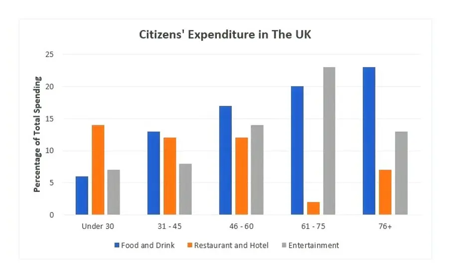
1.The chart below shows the expenditure on three categories among different age groups of residents in the UK in 2004. Summarise the information by selecting and reporting the main features, and make comparisons where relevant.
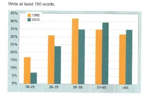
2.The chart below gives information on the percentage of British poeple giving money to charity by age range for the years 1990 and 2010. Summarise the information by selecting and reporting the main features and make comparisons where relevant.
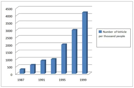
3. The bar chart compares the total number of vehicles per one thousand people in China who owns a car in the years 1987 to 1999.
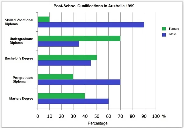
4. The chart below shows the different levels of post-school qualifications in Australia and the proportion of men and women who held them in 1999. Summarise the information by selecting and reporting the main features and make comparisons where relevant.
5. The graph below shows the percentage of people going to cinemas in one European country on different days. Summerize the information by selecting and reporting the main features, and make comparisons where relevant.
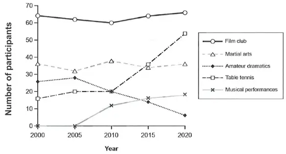
1. The line chart depicts the data of total participants for 5 distinct activities at a Melbourne social centre, in Australia between 2000 to 2020. Overall, those 5 different activities at a Melbourne social centre had their own patterns throughout the period.

2. You should spend about 20 minutes on this task.
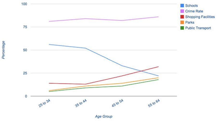
The line graph shows the percentage of people of different age groups and how they rate a set of factors in terms of importance when buying a new home.
Summarise the information by selecting and reporting the main features and make comparisons where relevant.
Write at least 150 words.
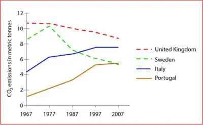
3. The graph below shows average carbon dioxide (C02) emissions per person in the United Kingdom, Sweden, Italy and Portugal between 1967 and 2007. Summarise the Information by selecting and reporting the main features, and make comparisons where relevant.
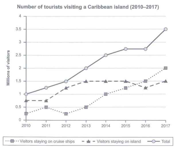
4. The graph below shows the number of tourists visiting a particular Caribben Island between 2010 – 2017.
Summarise the information by selecting and reporting the main features and make comparisons where relevent
write at least 150 words.
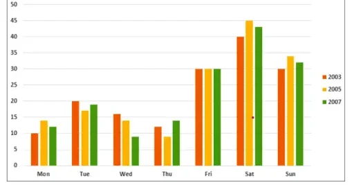
6. The graph below gives information on the numbers of participants for different activities at one social center in Melbourme, Australia for the period 2000 – 2020.
Summarise the information by selecting and reporting the main features and make comparisons where relevent
write at least 150 words.
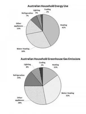
1. The first chart below shows how energy is used in an average Australian household. The second chart shows the greenhouse gas emissions which result from this enegy use.
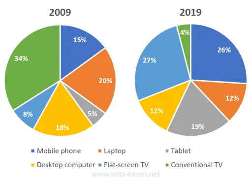
2. The pie charts below show the devices people in the 18 to 25 age group use to watch television in Canada in two different years. Summarise the information by selecting and reporting the main features, and make comparisons where relevant.
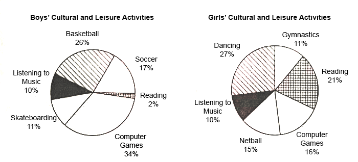
3. The pie graphs below show the result of a survey of children’s activities. The first graph shows the cultural and leisure activities that boys participate in, whereas the second graph shows the activities in which the girls participate.
Write a report describing the information shown in the two pie graphs.
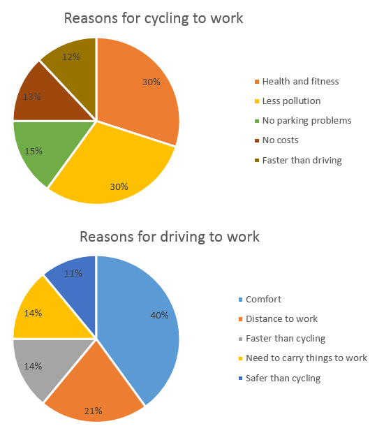
4. The charts below show the reasons why people travel to work by bicycle or by car.
Summarise the information by selecting and reporting the main features, and make comparisons where relevant.
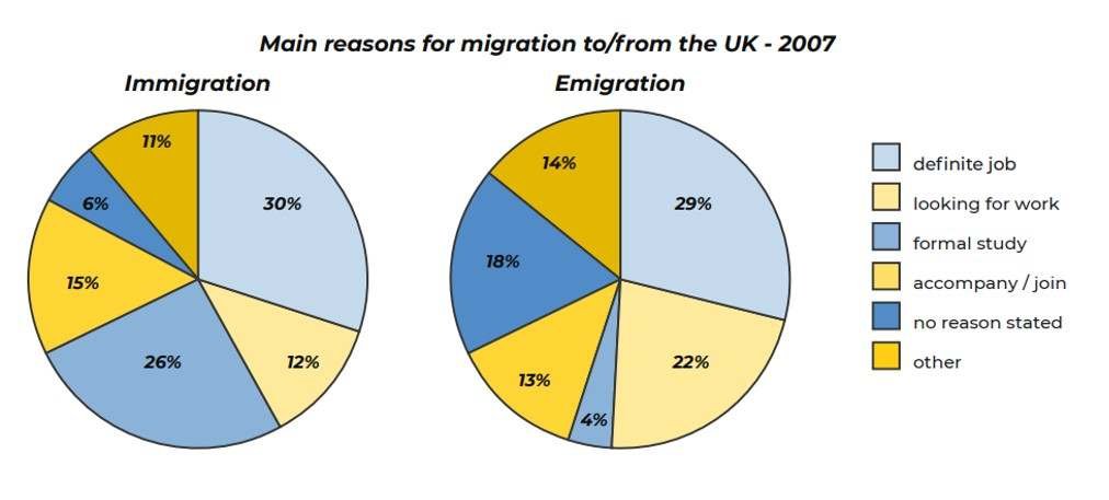
5. The two pie charts below show the main reasons for migration to / from the UK – 2007. Summarise the information by selecting and reporting the main features, and make comparisons where relevant.
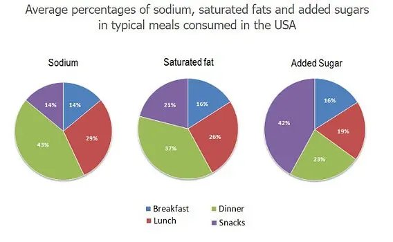
6. The three pie charts compare the composition of four different meals, namely breakfast, dinner, lunch and snacks, in terms of three nutrients, namely sodium, saturated fat and added sugar.
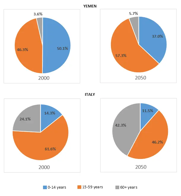
7. The charts below give information on the ages of the populations of Yemen and Italy in 2000 and projections for 2050. Summarise the information by selecting and reporting the main features, and make comparisons where relevant. YEMEN 2000 2050 e at lea 3.6% 5.7% 46.3% 50.1% 57.3% 37.0% 2000 24.1% ITALY 2050 14.3% 11.5% 42.3% 61.6% 46.2% 0-14 years 15-59 years 60+ years
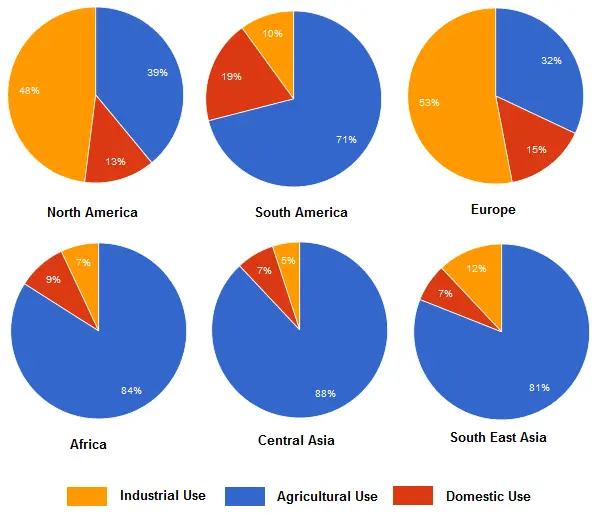
8. The charts below show the percentage of water used for different purposes in six areas of the word. Summarise the information by selecting and reporting the main feature and make comparisons relevant
1. The table below shows the percentage of the population and the types of houses they live in 3 areas of a city. Summarise the information by selecting and reporting the main features and make comparisons where relevant.

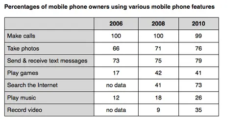
2. The table below shows the percentage of mobile phone owners using various mobile phone features. Write a report of at least 150 words, summarizing the information and making comparisons where relevant.
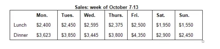
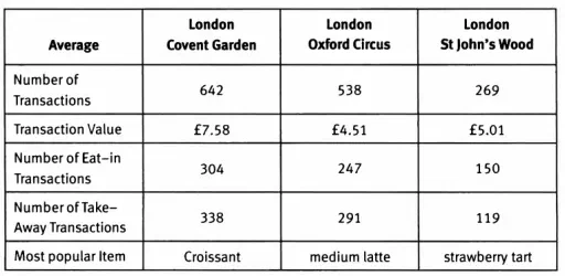
3. The table below shows the sales at a small restaurant in a downtown business district. Summarize the information by selecting and reporting the main features, and make comparisons where relevant.
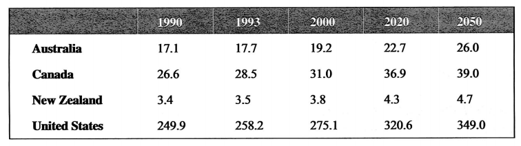
4. The table below gives information about past and projected population figures in various countries for different years. Summarise the information by selecting and reporting the main features, and make comparisons where relevant. Write at least 150 words.
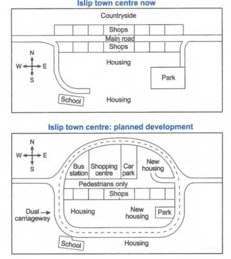
3. The maps below show the center of a small town called Islip as it is now, and plans for its development.
Summarise the information by selecting and reporting the main features, and make comparisons where relevant.
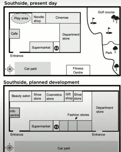
4. The maps show Southside, a shopping mall, as it is now, and plans for its development.
Summarise the information by selecting and reporting the main features, and make comparisons where relevant.
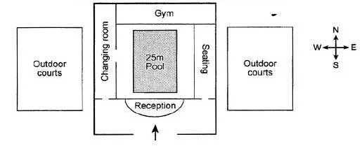
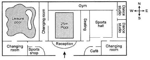
5. The plans below show the layout of a university’s sports center now, and how it will look after redevelopment.
Summarise the information by selecting and reporting the main features, and make comparisons where relevent.
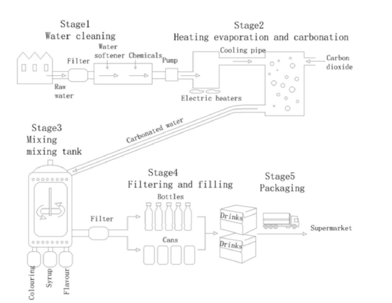
1. The diagram shows the process of making drinking water
Summarise the information by selecting and reporting the main features, and make comparisons where relevent.
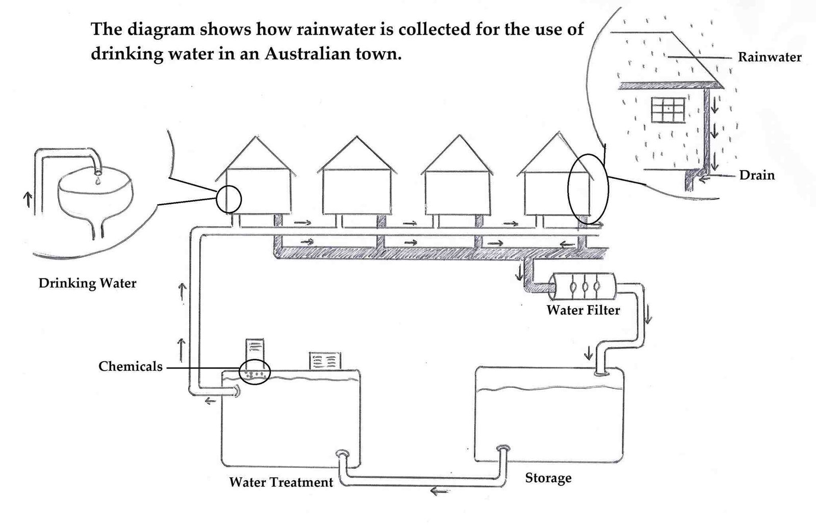
2. The diagram shows how rainwater is collected for the use of drinking water in an Australian town.
Summarise the information by selecting and reporting the main features, and make comparisons where relevent.
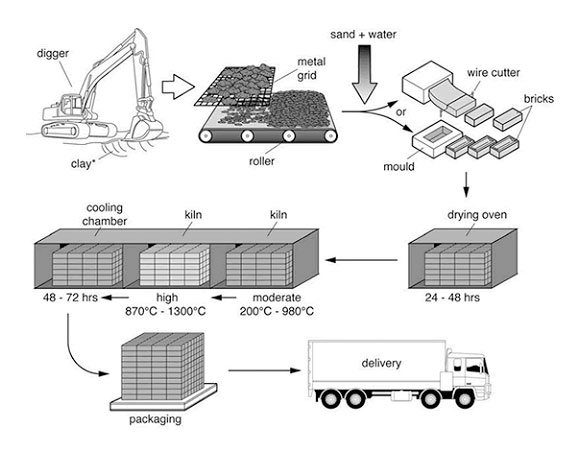
3. The diagram illustrates the process that is used to manufacture bricks for the building industry.
Summarise the information by selecting and reporting the main features and make comparisons where relevant.
Write at least 150 words.
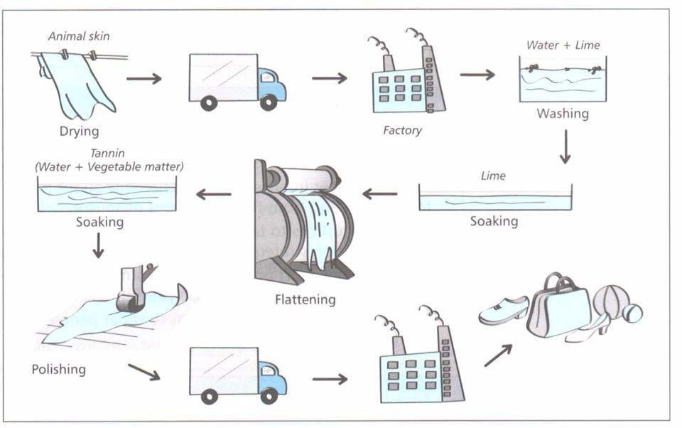
4. The diagram shows the making process of lather products.
Summarise the information by selecting and reporting the main features, and make comparisons where relevent.
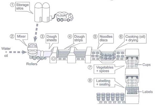
5. The diagram below shows how instant noodles are manufactured .
Summarise the information by selecting and reporting the main features and make comparisons where relevant.